October’s Stock Market Performance Has a Valuable Lesson

Image Credit: Jordan Doane (500px.com)

Looking Back at October and Forward to Year-End 2022

The stock market for October was a home run for many industries. In fact, only a few market sectors were negative, each by less than one percent. After a losing first three quarters in most categories, investors are now asking, are we out of the losing slump? Did I already miss the best plays? There are still two months left in 2022, and there are a number of expected events that could cause high volatility (up/down). If you’ve been a market spectator, you want to know, should I get on the field and maybe take advantage of this streak? If you’ve been involved and are now at a recent high, you may instead consider taking a seat for the last two months.

Let’s look back and then forward as we enter the final two months of the year. Below we look at the month behind us in stocks, gold, and crypto. There is something that may be unfolding is stocks that is worth steering around.

Major Market Indexes for October

Source: Koyfin

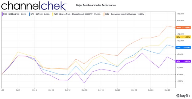
Large industrials, as measured by the Dow 30, had the best comparative performance in October. In fact, the Dow had its best month since 1976. Some investors have been rotating out of large high-tech and into more traditional businesses, like large industrial companies. Another reason it has gotten attention is of the 30 stocks in the Dow Industrials, at least 27 are expected to pay dividends; the lower stock prices from months of decline have raised the expected dividend yields to levels where investors are finding value and doing some reallocating. For example, Dow Chemicals (DOW)with a yield near 5% (plus any appreciations) or Verizon (VZ) at 7% can be appealing, especially for assets of retirees.

The small-cap stocks, as measured by the Russell 2000, weren’t far behind the Dow 30. This group has been lagging for some time and, by many measures, including price/earnings, offers value, while many larger stocks are still considered overpriced. Another thing working in favor of small U.S.-based companies is a likely customer universe that is not hurt by a strong dollar and international trade. In fact, there are small companies that can be shown to have benefitted from a strong native currency and have a competitive advantage with lower borrowing needs. Many analysts expect continued outperformance of the small-cap sector as it offers value and less global disruption.

The top 500 largest stocks, as measured by the S&P 500, had a very good month but are being dragged down by the large weighting of a few huge companies that the market feels have gotten way ahead of where they should be reasonably priced. The Nasdaq 100, shown above as returning only around 3.6%, has been hurt by this index weighting as well. These indexes had once benefitted from these few stocks flying high during the pandemic; the post-pandemic world, as well as global headwinds, are now working against them.

Major Market Indexes Through 10/2022

Source: Koyfin

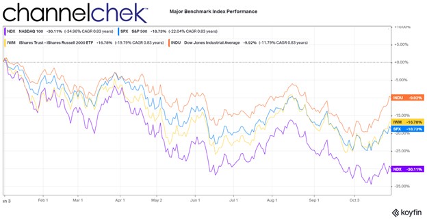
Investors have been taught that index funds and ETFs provide diversification, but that has never been true of Dow-indexed funds (30 stocks). And the S&P and Nasdaq 100, with heavy weightings in a few companies, only give the illusion of broad exposure. The S&P 500 and Nasdaq 100 relative performance during October may cause more investors to consider hand-selecting companies with lower P/Es, lower global exposure, and higher growth potential.

Sectors Within S&P Index

Source: Koyfin

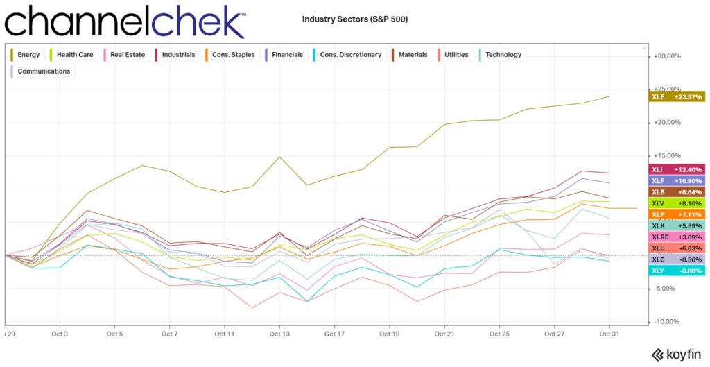
Oil companies regained their lead as they have been a sector detached from other stocks since late 2019. The industrial sector was second and followed by the only other industry above double digits, finance. Most (not all) financial companies benefit from higher interest rates, and those that take deposits (short-term) and lend money (long-term) do best with a steep yield curve.

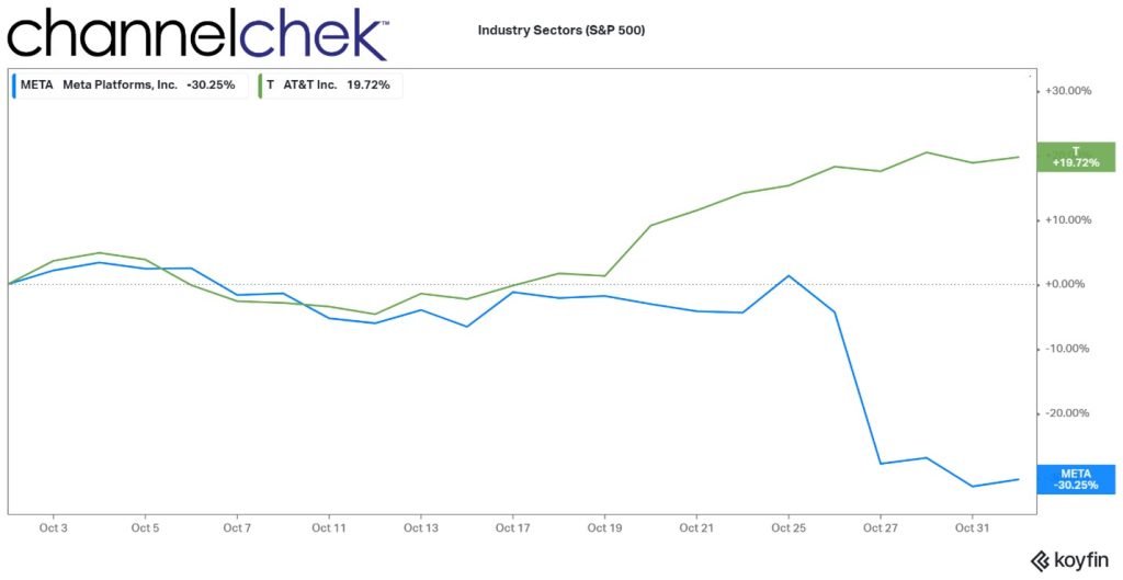
On the bottom of the list are consumer discretionary companies, which are hurt by the strong dollar and a weakening economy; this sector is followed by communication. Communication is worth a deeper dive as it exemplifies how the weighting of stocks in popular indexes can hurt index returns – some say high-flying, highly weighted stocks are even in a bubble.

Below the chart compares two names in the S&P 500 that are also represented in the communications index. Meta (META) is 17.70% of the index and is down 30% in October. AT&T (T) is 4.70% of the communications index; it returned nearly 20% for the month. The funds weighting methodology that worked to the advantage of index investors, until it didn’t, has worked against some index investors.

Source: Koyfin

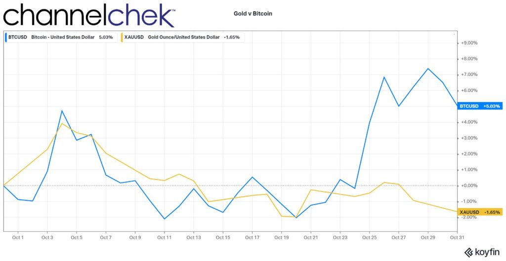
There is a rivalry of sorts between larger, more accepted cryptocurrencies and gold. Gold wants to regain its centuries-old place as the hard asset that best represents safety, even in the worst conditions, and Bitcoin or Ether, which is looking for respect, as the alternative asset that represents safety.

Crypto has been loosely moving in the same direction as stocks all year. October was no exception, as its price per dollar rose significantly during the month. Gold, despite much worry in the world, continued a slow downtrend.

Gold and Bitcoin Performance

Source: Koyfin

Take Away

Stock market participants that held on finally got a month where it was hard not to come out ahead. The question now is, do you take the gains and sit tight while the fed tightening, election, war, and global recession settle? Or do you look at the current dynamics and allocate where the highest probability of success lies? Maybe small-cap value stocks or oil and gas companies.

There is one thing investors have been warned about repeatedly over the years by well-respected investors, including Michael Burry. There is a risk inherent in indexes now that a few extremely “overpriced” stocks represent a large percentage of index funds.

Investors evaluating smaller, individual stocks have found the data and analysis on Channelchek to be indispensable. Be sure to sign-up for Channelchek at no cost to receive unbiased research on companies that are less talked about, but may have a place in your portfolio mix.

Paul Hoffman

Managing Editor, Channelchek

Sources

https://home.treasury.gov/news/press-releases/jy1062

https://indexarb.com/dividendYieldSorteddj.html

https://www.marketwatch.com/investing/fund/xlc/holdings

When Stocks Instead of TIPS are Better Hedges Against Inflation

Image Credit: U.S. Dept. of Treasury

What’s the Best Inflation Fighter for Your Savings? Stocks or TIPS?

At a minimum, an investor with an eye toward having more, not less, in the future needs to beat the rate of inflation. Ideally, since the investor ties up their money, the buying power in their account should provide the current inflation rate plus a risk premium over the medium to long term. During the past few months, a number of long-term savers/investors have asked me what I thought about TIPS as a means of exceeding inflation. I have strong opinions on these Treasury securities. My thoughts are rooted in having been a portfolio manager for the country’s second-largest fixed income fund manager back in 1996 when the U.S. Treasury asked for our input on the design of the new bond. The Treasury wanted us to approve of the bonds enough to invest in them – in early 1997 I pulled the trigger on $100 million in the first ever TIPS auction – that was 25 years ago, and there is now enough data to compare the performance of Stocks, TIPS and the rate of inflation. Which one provides better inflation “protection”?

Some Details on TIPS

If you aren’t aware of the intricacies and history of the Treasury Inflation-Indexed Securities, dubbed TIPS, as the working name for the project back in 1996, here’s what you should know in a two paragraphs.

Interest rates were declining through the late 1990s and the Treasury Secretary Robert Rubin had a plan to lessen the government’s interest rate burden by issuing a bond with costs that would be lower with the declining inflation and interest rates. The Canadians, British, and Australians all had a bond type that floated with the countries’ inflation index. The Canadian-style bond had a fixed rate of interest where the principal accreted upward with an inflation index. On this new principal, an unaffected fixed-rate (coupon) would pay interest. The British and the Aussies paid the inflation addition with the coupon, the bondholder didn’t have to wait until maturity to be compensated for price increases. The U.S. adopted the Canadian system of accreting to principal.

The new bond was to be helpful to the U.S. Treasury, the conservative investor, and even the Federal Reserve. Inflation was sinking at the time, so investors were attracted in part to the idea that the securities effectively have a floor since the Treasury would never lower the principal accretion to below zero even if deflation became a problem. Retirees were told they should be thrilled to have a low-risk investment to choose from that paid inflation plus. The U.S. Treasury was looking forward to being able to reduce the interest costs of its debt as there were still bonds outstanding that were paying 14%. As for the Chairman of the Federal Reserve, Alan Greenspan, he was thrilled he’d have a constantly updating investor-driven mechanism that would indicate the market’s current expectation of inflation.

Inflation “Get Real”

Through the late seventies and into the early eighties, inflation was a big influencer on all household decisions. Durable items like washing machines were purchased sooner rather than later because they may cost much more later. Even borrowing to buy made good financial sense. As for investing or saving,  buying short bonds or CDs that always paid more than inflations and then reinvesting similarly when it came due provided the investor with a little more income than inflation (and sometimes a free toaster). The stock market had years where it had negative returns, but for the medium or long-term saver, it far exceeded inflation. This has not seemed to have changed. 

“Get Real” is a slogan that had been used by brokers trying to build enthusiasm for TIPS when they first came out. It refers to real yield, or put another way, the yield after inflation. TIPS were designed to pay the inflation rate plus an interest rate, so the investor earns a real yield. What no one anticipated when the securities were designed is the real yield could go negative, thus providing the investor with inflation minus whatever supply and demand decided.

The chart below demonstrates that over a recent 11-year period, TIPS paid negative real rates about a third of the time. They did not provide the investors with a return above the rate of inflation as originally envisioned.

Source: St. Louis Federal Reserve

Stocks are not designed to be correlated with the rate of inflation, but they generally do well when the economy is flourishing or expected to flourish (these periods tend to be associated with inflation). And equities fall off when there is a contraction or expectations of a bad business climate. The chart below uses the Russell 2000 Small-Cap Index as a measure of stock market performance. The period shown demonstrates that if one is looking to keep up with or beat inflation by any margin, Small-Cap stocks can be viewed as far superior to TIPS.

Source: Koyfin

During the period from August 2012 until August 2022, prices have risen a combined amount of 28.558%, according to a calculator provided by the Bureau of Labor Statistics. During the same period, an investment in TIPS provided 13.11% to the saver/investor. This equates to a real return of negative 15% over ten years. If the purpose of the investor is to keep up with and beat inflation, TIPS have failed as a decent option.

As for stocks, the downside over short periods has been much larger and deeper declines than TIPS. However, after year one, the declines were never large enough to show underperformance. TIPS failed its main goal of inflation plus. If an investor instead put money in small-cap stocks, they would have exceeded inflation by 110%.

While this is not predictive of the future, it is compelling evidence for anyone with a time horizon beyond a few years to look at the true risk profile of each. TIPS have performed worse than inflation. One reason for this is that bond prices have been held lower than the market would naturally have them because the Fed has taken so many on its balance sheet.

Take Away

The performance of the stock market over the medium to long term has a long history of beating returns of other assets, especially those of bonds. Treasury Inflation-Indexed Securities, the official name for the bond, does not have a “P” in it. The “P” was supposed to stand for “Protected.” Just prior to the first auction, the name was changed as government lawyers pointed out these may not protect the investor from inflation.

The Federal Reserve owns a third of the outstanding U.S. Treasuries, including a large allocation of TIPS.  This unnatural demand holds prices artificially below where the market would price them without the Fed’s impact. This skewing of the results would have been upsetting to former Fed head Alan Greenspan who felt the main appeal to the security was their ability to help predict future inflation.

Stocks have risks, and bonds have risks, if it’s inflation you’re looking to overcome, inflation-linked bonds have been historically off the mark.

Paul Hoffman Managing Editor, Channelchek

Sources

https://www.nytimes.com/1982/02/05/business/record-set-on-30-year-us-bonds.html

https://www.treasurydirect.gov/instit/annceresult/tipscpi/tipscpi.htm

https://www.bls.gov/data/inflation_calculator.htm

https://www.federalreserve.gov/monetarypolicy/bst_recenttrends.htm

Don’t Fear the Rate Hike

Image Credit: Samer Daboul (Pexels)

Historically, Tightening Cycles Have Not Caused Long-Lasting Market Damage

The Fed does not plan on having a tight monetary policy, just a less easy one.

On March 16, 2022, the FOMC Committee announced their intention to target a fed funds rate that would be 0.25% higher than it had been. It was the first increase since December 2018, and the hike more than doubled this key interest rate. Fed Chair Powell made it clear it would not be the Committee’s last.

Less than two months later, on May 4, the Fed adjusted the overnight target by an additional 0.50%. This was the largest increase since the year 2000.   But they were just getting started. They suspected they had fallen behind in their mandate of keeping inflation down. Stable prices generally mean balancing supply and demand, and since the Fed couldn’t do much to raise the consumable supply, they acted to dampen demand. They made money more expensive. In mid-June, the Fed hiked by 0.75%, in late July it pushed them up by 0.75% again, and that was the last time the FOMC met.

The next meeting will be held September 20-21st. The perceived guidance is that they will raise rates again by a similar amount as they did in June and July.

Tightening Cycles

The current tightening cycle is a concern for those that fear that it may lower asset prices and lower business activity. The concerns are warranted as tightening cycles are designed to do exactly that, tame prices and slow economic growth. It’s tough medicine but is supposed to provide for better economic health long term.

Over the past 30 years, the Fed has convened four recognized tightening cycles – periods when it increased the federal funds rate multiple times.

Source: Federal Reserve

Over three decades, the median number of rate hikes per period is eight, and the median time frame is 18 months (from first to last). How has the economy and markets fared through this recent history? Only two of the periods, the one ending in 2000 and then in 2006, were associated with a recession. In all four cases, the market retreated at first.

If one uses GDP as a measuring stick for an economy that is either growing or receding, then the U.S. was in a recessionary economy for a calendar quarter before the initial 0.25% hike. So the tightening may not put us into a recession, but it does have the potential to retard growth further for a  deeper recession.

Market Performance

Markets have traded lower in the months following the start of a tightening cycle, but in each of the periods defined above, they have ended higher one year later. It would seem that the market fear of what slower growth would do for companies and stock prices were front-loaded; those fears then gave way to buying as expectations became better defined.

Source: Koyfin

For the tightening cycle that began in 1994, a year after the Fed first took aim at the economy, the S&P 500 Index had already bounced off its low and climbed rapidly to end the 12 months with a positive 2.41% return. At it’s worst, the index had given up 6.50%.

Source: Koyfin

Four months after the tightening cycle began in 1999, the market began marching higher and crossed the breakeven point three times. The first time in August, just 45 days into the cycle, and the last one in May of 2000. For the 12-month period an investor in the index would have gained 5.97%.

Source: Koyfin

In 2004 the tightening cycle again began on June 30. Stock movement over the 12 months that followed are very similar as 1999. For investors that held for five months, (assuming their holdings approximated this benchmark) they were treated with returns of 4.43% 12 months later.    

Source: Koyfin

The most recent tightening cycle was seven years ago and began in December. Those invested in securities in 2015 that followed the overall stock market quickly broke even, and for those that held, they were up 10.81% a year later.

On average over the four periods the S&P 500 returned better than 6% after the Fed began a prolonged tightening cycle. The median drawdown is observed to be 9% in the first 49 days following the Fed’s first rate hike. For those that were invested in stocks that were more closely correlated to other indices, their experience was different.

Other Indices (Small Cap, Value, Growth)

Source: Bloomberg

The best average, although it did have a negative return in one of the periods, is the performance of the small cap Russell 2000 index. Investors in small cap stocks would have earned almost twice as much (11.30%) as those invested in the S&P 500 Large cap, almost three times as much earnings as those invested in the Russell 1000 Value stocks, and far more consistent and more than three times the Russell 1000 Growth index.

Take Away

This is not the first time the Federal Reserve has raised rates and implemented a tighter monetary policy. In the past it has not meant doom for the economy. In fact, the policy shift is intended to preserve a healthy economy before it begins causing larger problems for those that depend on jobs and stable prices along with a orderly banking system.

The most recent tightening cycle began six months ago. If history is an indicator, it may last another year, during that time stocks will rebound to a level higher than they were in March when the cycle began. While there are no guarantees that history will accurately point to the future, it helps to know what happened the last four times. Investors may also look to increase their allocation into small cap stocks as they have by far outpaced other indices.

Paul Hoffman

Managing Editor, Channelchek

Sources

https://www.federalreserve.gov/datadownload/Choose.aspx?rel=PRATES

https://www.forbes.com/advisor/investing/fed-funds-rate-history/

https://www.putnam.com/advisor/content/perspectives/